
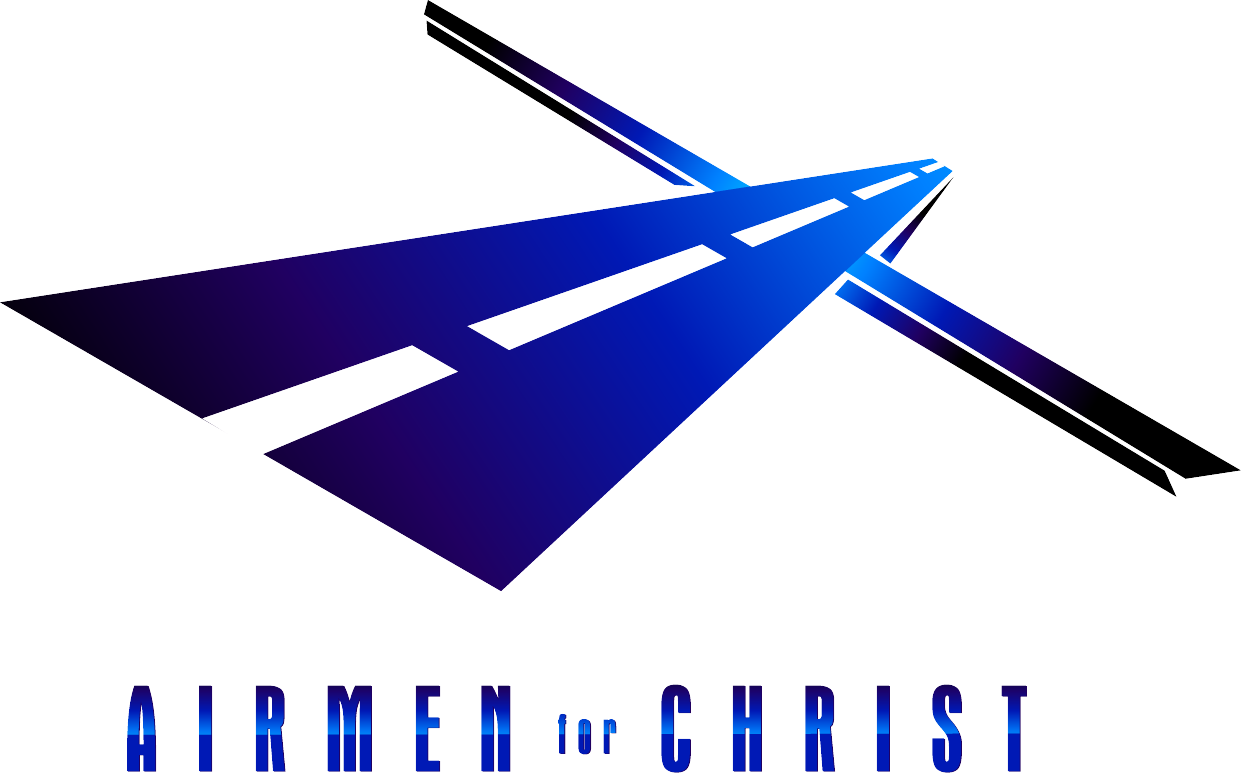
Airmen for Christ, a branch of Military Ministries/Campus Crusade for Christ received a catchy AND symbolic logo for their brand. (See the road? See the cross? It’s the Journey + Christ = a life with Christ. )
The audience:
- predominately male (Hence, the masculine typeface)
- ages 18-26 (So the modern typeface and a contemporary look followed)
- new to the USAF (the color choice was obvious, blue, everything must be blue)
- new to church with little religious affiliation (Therefore, avoiding popular Christian symbols and obscure bible references was key)
Uniquely, this logo would be primarily viewed from a projection screen that sourced it from a DVD player. I have fond memories from this project, knowing the good work that this ministry accomplishes every week.
The road + the cross also looks like a plane! Cool